- by Jörn Meyer
- published
Oh poor, poor Bethany…
Hello folks! I know it’s been a while since you read from me, but that has beautiful reasons: I was travelling the world! Not only have I been to the US of A to visit scenic Pennsylvania, but I also pitched my tent between the rugged mountains on the Isle of Skye in Scotland.
The vacations were a much-needed break from work to get my creative juices flowing again, and boy oh boy, did it work! The first illustration after my absence was for the NoSleep podcast:
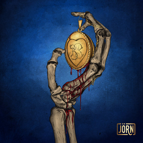
Ladies and Gentlemen, meet Bethany:

Bad to the bones
WARNING: SPOILERS FOR THE STORY AHEAD!
When I first read the story, “Secrets and Motives”, by author Tristan Lince, I immediately had the finished image in my head and “just” had to put it on the digital canvas! When you listen to the story, you might find yourself agreeing that the skeletal hand is a striking image.
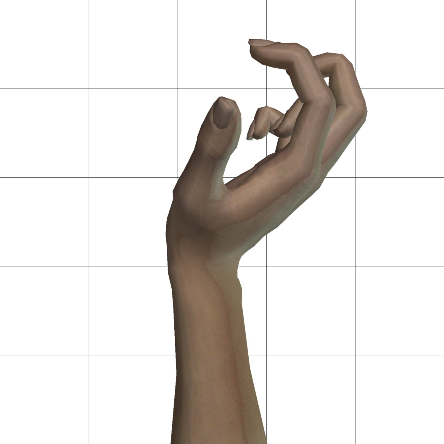
I picked up my iPad and began the process of creating the image. As a first step, I used an app called Handy Art Reference Tool that allowed me to pose a digital hand exactly like I wanted it to:

The main challenge here was posing the hand in a way that would hide the missing fingers! I wanted the NoSleep fans to think it would be just your typical, run-of-the-mill skeletal hand and to realize the fact that it’s owner suffered an injury only after listening to the story!
Then, I googled around for some medical illustrations and brushed up on the actual anatomy of the human hand. Since I didn’t find any reference images that matched the pose I had in mind, of course, I had to figure out how the bones would be arranged if they would be arranged the way my digital hand was.
Here’s me figuring it out, in sketch form:
Stretching my legs in a new art style
I’ve been realing enjoying the digital ink look I used in my illustration Driftwood, but I wanted to try out how the style would look if I added some color to it.
I wanted the color to be less polished than my other illustrations. Mr. Clacky-Teeth, for example, has a more photorealistic look, but I was pretty sure that would clash with the illustrative look of this piece.
So I used a broader, more textured brush for painting and blended the colors less. Thus, I was able to achieve a more natural and painterly look for the artwork.
Back in the game
I’m really happy that the NoSleep Podcast gave me the opportunity to stretch my art legs again.
There are some very cool things and projects coming my way soon, and I promise that you guys will be the first to hear about it.
As always, I hope you enjoyed this illustration and I will see you soon!
Take care, my lovelies,
